Images/date/200707: Difference between revisions
JoshuaJSlone (talk | contribs) No edit summary |
JoshuaJSlone (talk | contribs) m (1 revision imported) |
(No difference)
| |
Latest revision as of 21:32, 16 April 2023
src=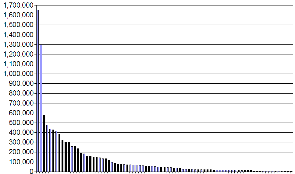
Comparing PS2 and Wii Japanese software sales through their first 30 weeks. Blue Wii, black PS2. I compiled dozens of weeks of Famitsu data for each system to come to those totals, and this was the beginning of me really considering adding software stuff to my game database, for the purposes of looking at what software sales looked like at arbitrary time point X, rather than just seeing final sales on a list as most sites have.
src=
After someone used the conflated "brain science" instead of brain surgery/rocket science, I considered: who is currently more well-known in brain science than Dr. Kawashima. I combined him with Jambi from Pee-Wee's Playhouse, so as to pair it with the text "Brain science? Did somebody say brain science?"
src=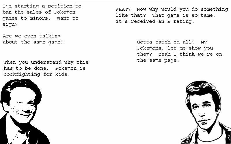
Only (most of) the faces are changed from the original, where they were animals or something. The freckles of one of the original character reminded me of Ralph Malph, and Fonzie was the logical other to pair him with. It kinda shows that I had to fake up a monochrome Ralph while the Fonz sketch came from Google Image Search, but hey. As to why in the first place? It was just so punchlineless that something needed to be done.
src=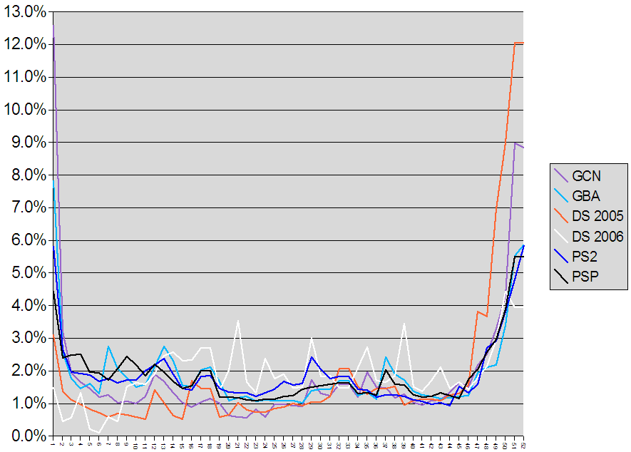
I wanted to see if there were noticeably different patterns of sales throughout the year for different systems. Like, would it be true that Nintendo systems sold more of their yearly total around Christmas/New Year's? So I took averages of the different years of sales for GCN/GBA/PS2/PSP, left DS 2005 and 2006 split because they were so different, and calculated what percent of the year's sales came from each week.
src=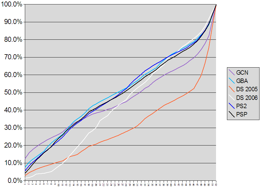
And here it is as things sum up throughout the year. Of course everything starts at 0 and ends at 100, but the journey is what's interesting.
src=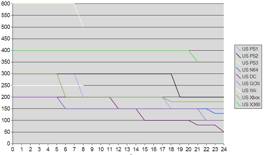
A look at price cuts for systems in the US, with the X value being months from launch. It can be harder to display stuff like this graphically, since lines can be straight for so long and overlap with other systems for long periods of time.