HandPEAT River City Ransom NES
<center>{IMG(src="http://joshuajamesslone.name/images/handpeat/rivercityransomnes/logo.png")}{IMG}</center>
<center>{IMG(src="http://joshuajamesslone.name/images/handpeat/rivercityransomnes/logopeat.png")}{IMG}</center>


Made October 13-15, 2011.
The "River City" part is a tricky proposal. Â It's meant to be imperfect writing, and I'm trying to scale it up as perfectly as possible. Â It's necessarily going to end up smoother than it probably should. Â Took a long time, too, as I used a lot of a technique I haven't done much before, for better smoothing out lines of uneven slope.
Historically accurate error: the right side of the R rectangle had a pattern of going down 3 pixels for every one to the right, EXCEPT for a bit where the 3 3 3 3 is broken up by a 2 4. Â So in the larger versions it looks like a little bump where the R rectangle hits the A rectangle.
Modified October 17, 2011. Â I realized I could use that technique for uneven slopes on the error mentioned above. Â So I satisfied my desire to keep the error, but also interpret it in a less ugly way. Â Instead of "2 4" being tripled to "2 2 2 4 4 4", making it "2 4 2 4 2 4" makes it not seem off unless you zoom in.
---
<center>{IMG(src="http://joshuajamesslone.name/images/handpeat/rivercityransomnes/font.png")}{IMG}</center>
<center>{IMG(src="http://joshuajamesslone.name/images/handpeat/rivercityransomnes/fontpeat.png")}{IMG}</center>
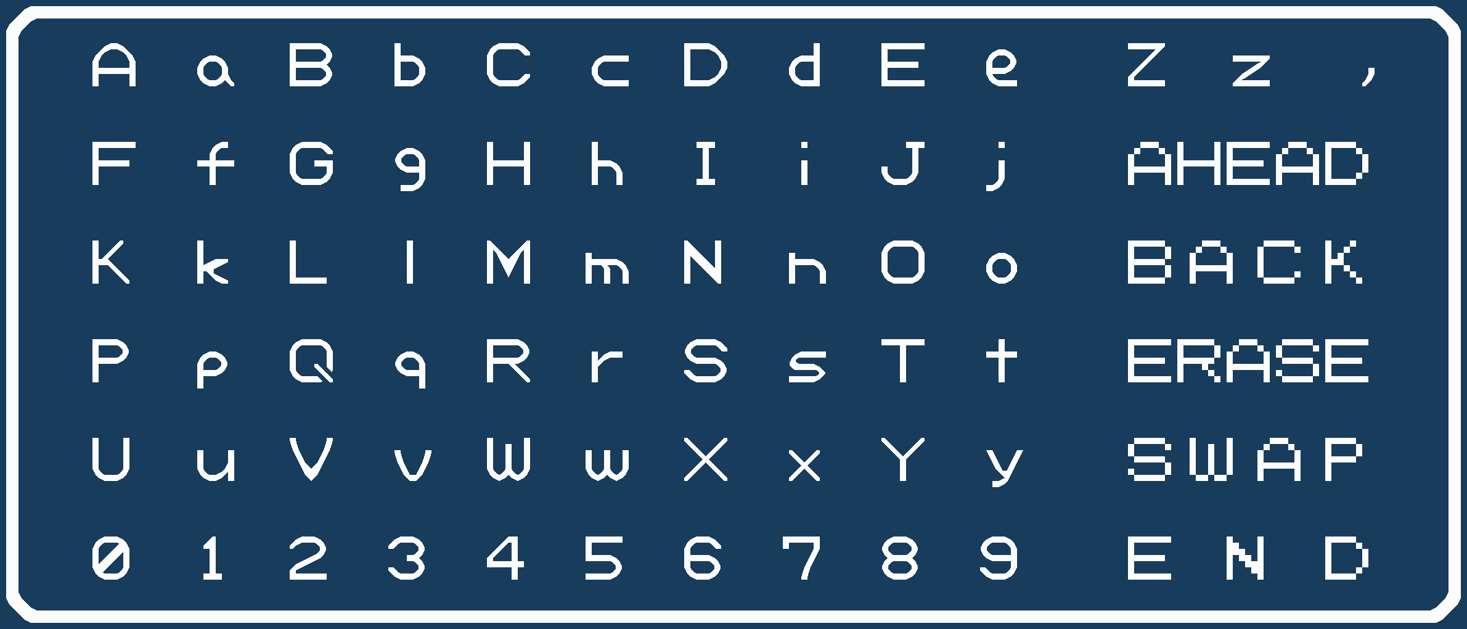
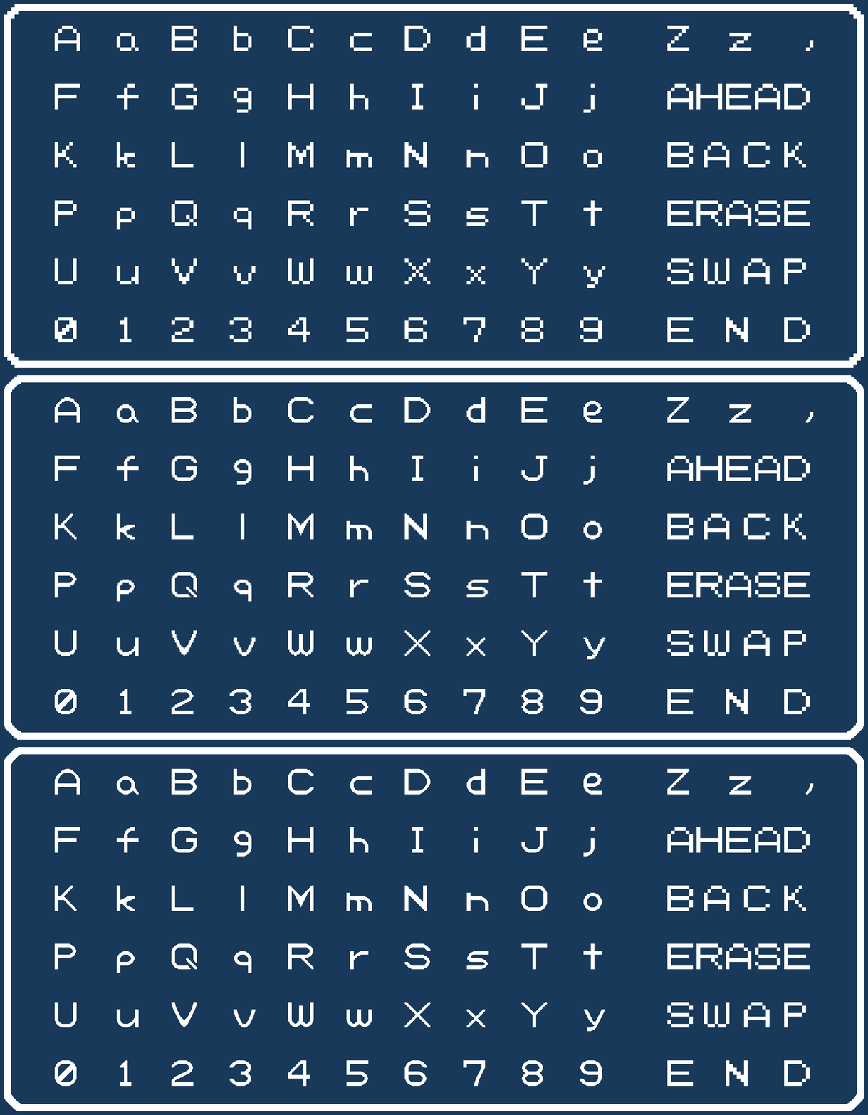
Made October 15, 2011.
I really really really like this one. Â Almost everything looks great; though K, k, and s stand out as stinkers.