HandPEAT River City Ransom NES
<center>{IMG(src="http://joshuajamesslone.name/images/handpeat/rivercityransomnes/logo.png")}{IMG}</center>
<center>{IMG(src="http://joshuajamesslone.name/images/handpeat/rivercityransomnes/logopeat.png")}{IMG}</center>
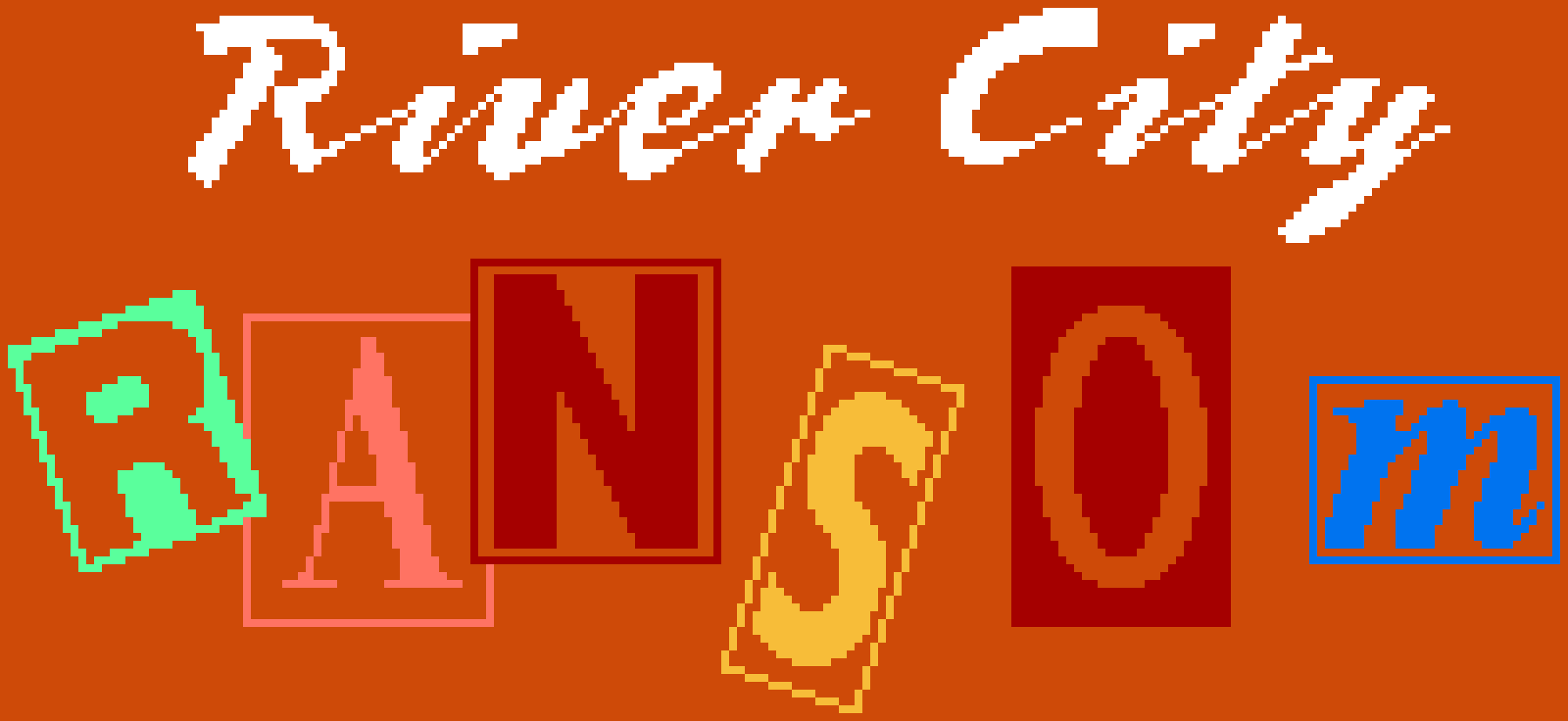
Made October 13-15, 2011.
The "River City" part is a tricky proposal. It's meant to be imperfect writing, and I'm trying to scale it up as perfectly as possible. It's necessarily going to end up smoother than it probably should. Took a long time, too, as I used a lot of a technique I haven't done much before, for better smoothing out lines of uneven slope.
Historically accurate error: the right side of the R rectangle had a pattern of going down 3 pixels for every one to the right, EXCEPT for a bit where the 3 3 3 3 is broken up by a 2 4. So in the larger versions it looks like a little bump where the R rectangle hits the A rectangle.
Modified October 17, 2011. I realized I could use that technique for uneven slopes on the error mentioned above. So I satisfied my desire to keep the error, but also interpret it in a less ugly way. Instead of "2 4" being tripled to "2 2 2 4 4 4", making it "2 4 2 4 2 4" makes it not seem off unless you zoom in.
---
<center>{IMG(src="http://joshuajamesslone.name/images/handpeat/rivercityransomnes/font.png")}{IMG}</center>
<center>{IMG(src="http://joshuajamesslone.name/images/handpeat/rivercityransomnes/fontpeat.png")}{IMG}</center>
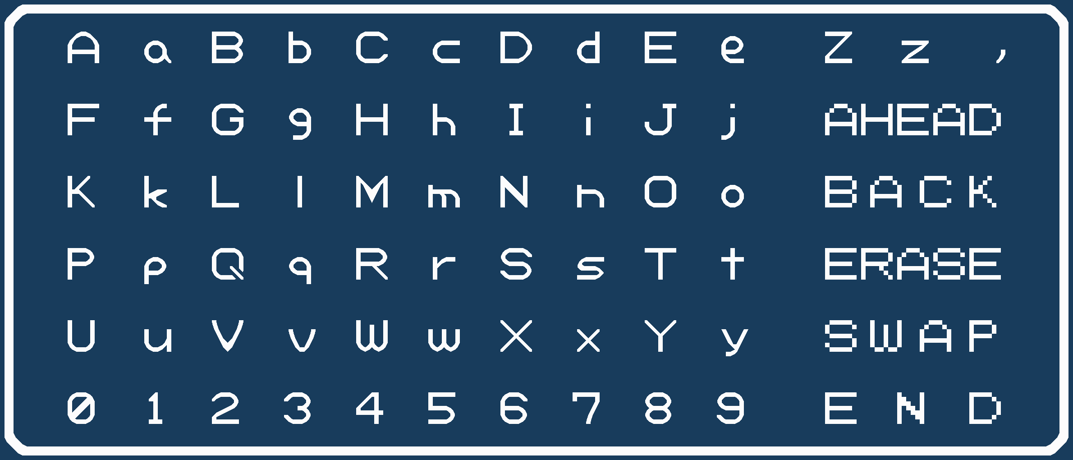
Made October 15, 2011.
I really really really like this one. Almost everything looks great; though K, k, and s stand out as stinkers.